Fundamental indicators allow a measurement of the state of economies in the future. If you are somewhat familiar with investing and trading, you undoubtedly already had contact with indicators.
Introduction
Many inexperienced traders solely focus on Technical Indicators used in Technical Analysis to predict price changes of one asset based on current trends or technical patterns in the charts.
There are other categories of indicators, as well. In this article, I’d like to introduce you to a simplified model of the financial markets, a theory that is built on top of that model, and two indicators that give you an (albeit imperfect!) crystal ball to provide you with a clearer picture of the economic conditions in the future.
Instead of Technical Analysis, we look into the methodology of Fundamental Analysis. Fundamental indicators measure the current state of economies and allow the prediction of growth (or shrinking) of industry sectors, regions, or even the global economy.
Economic backdrop for fundamental indicators
Let’s start with building a simplified model of financial markets. Like every model, it simplifies the real world but should allow valuable forecasts for the future.
The movements of financial markets on very short timeframes (seconds, minutes, hours) seem entirely random. We can identify phases where markets move up and down in cycles on higher timeframes.
For every product, commodity, currency, stock, or anything else that has a price and is traded on the market, there seems to be a connection between demand and supply: higher demand will lead to higher prices (given constant supply) and vice versa. Higher supply will lead to lower prices (given constant demand) and vice versa.
Also, there are connections between different markets: producers of goods have to buy raw materials, energy supply on markets, creating a dependency on their prices: every price change of raw materials will lead to more (or less) profits those producers can achieve with their products.
I’d like to introduce you to one model that explains the market’s dependencies and price movements. Like every model, it is an abstraction of reality, and as the British statistician George Box famously said: “All models are wrong- but some are useful.” Meet- the Efficient Market Hypothesis.
Efficient Market Hypothesis
This theory assumes the financial markets as a vast information processing mechanism. Every news and data item, like company earnings, political events, and environmental conditions (like weather), is constantly processed. Not only for current news but also for anticipated future ones. This information processing machine constantly prices and reprices each data item into a constant flow of ups and downs of the financial markets.
“According to this view, the stock exchange is the fastest and most efficient data-processing system humankind has so far created. […] The stock exchange runs the global economy and takes into account everything that happens all over the planet- and beyond it. Prices are influenced by successful scientific experiments, by political scandals in Japan, by volcanic eruptions in Iceland, and even by irregular activities on the surface of the sun. […] It has been estimated that the stock exchange needs just fifteen minutes of trade to determine the influence of a New York Times headline on the prices of most shares.” (Yuval Noah Harari from his 2017 book Homo Deus)
This pricing mechanism is assumed to be perfect: all available information results in perfect prices at any given time. This is also the starting point of criticism about the model: a perfect pricing mechanism would not allow for bubbles and mispriced stocks- both are observable in reality.
Dow Theory
Building on the Efficient market hypothesis, the Dow Theory states that financial markets operate in cycles called trends. There are trends in long time frames (months to years), called bull markets when going up and bear markets when going down.
Within those higher-level trends, pullbacks and bear market rallies happen, lasting from one to a few months. Trends on shorter timeframes (below a month) are considered noise.
The Dow Theory further defines the conditions that have to be met that constitute a trend and the distinctive phases each trend undergoes. As this is not an in-depth explanation of Dow Theory, we won’t dive too deep into this article.
Dow Jones Transportation Average
The Dow Jones Transportation Average is an index constructed by transportation and logistics companies. Using this index as an indicator for the US economy builds on the Dow Theory and thus assumes efficient markets. The logic in the early 19th century (when the index was created) went as follows: the manufacturers produced goods, and the transportation sector had to transport those to the customers. So if demand were high, the books of the transportation sector would be filled, and thus a booming transportation sector meant a thriving economy. When demand for transportation fell, this could be interpreted as a fall in demand, thus indicating a shrinking economy.
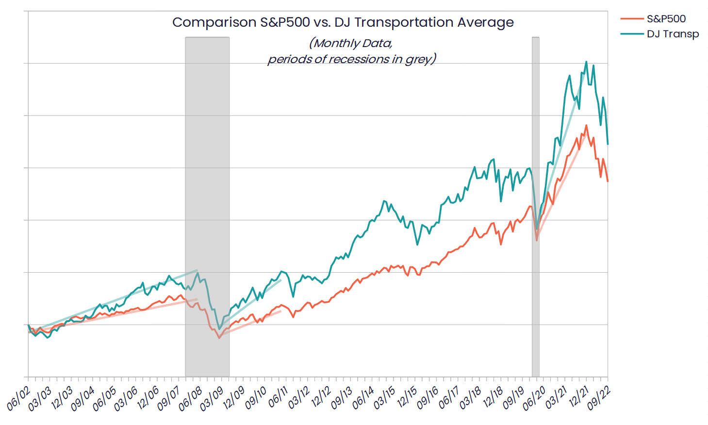
As the economic landscape has shifted over the last 120 years, the transportation sector lost some importance for the US economy. A look at the last 20 years reveals that the DJ Transportation average nowadays does not reliably predict recessions:

The chart shows about 20 years of data for the S&P500- a broad US market index and the Dow Jones Transportation Average. I added the two recessions within this period as grey areas (another recession from 03/2001 – 11/2001 in the wake of the tech bubble had just ended). Ignore the straight lines for now- we’ll need them later.
As is visible, the broad stock markets generally go down with recessions. The DJ Transportation Average, as a subset of the overall market, tends to dive even steeper and more profound than the rest. The DJ Transporter did not signal the great depression 2007-2009 (it even lagged behind a couple of months) nor the COVID crisis in 2020.
Transportation sector performance after recessions
However, what is interesting, is that the stock market bottom BEFORE a recession ends and starts to rise for 1-6 months before recession indicators (negative GDP, unemployment, PMI, production, and sales numbers) turn positive.
Another interesting fact became more apparent when I ran a linear regression for the recovery periods of the stock markets: It became visible that the Transportation sector recovered faster than the broad stock market. The regression lines I mentioned earlier are steeper for the DJ Transporter than the S&P500. In other words: coming out of recessions, the Transportation sector outperformed the broad market during the last 20 years. You don’t need perfect timing for those recoveries (remember, market timing is impossible after all)- each recovery rally lasted years.
Baltic Dry Index
Meet the DJ Transporters’ global cousin: The Baltic Dry Index. This index measures the transport cost for bulk freight (dry raw materials like grain, coal, and metals). This index is not comprised of stocks but calculated by contacting shipping brokers for transport rates (for different ship sizes, routes, and freight).
Applying the same logic of the dependency between logistic chains, global demand, and industrial production as in the chapter above, we can use the shipping costs as an indicator of global demand for raw materials- and thus the anticipated state of the worldwide economy in the nearer future.
If producers see increased demand for their goods and services in the future, they ramp up their demand for raw materials and commodities- thus increasing the need for transportation. Vice versa, damped business prospects will lead to producers ramping down their production, thus demanding less transportation for bulk materials. Because of the time delay in the impacts of those production chains, the Baltic Dry is generally considered an early indicator of global economic slowdown and expansion.
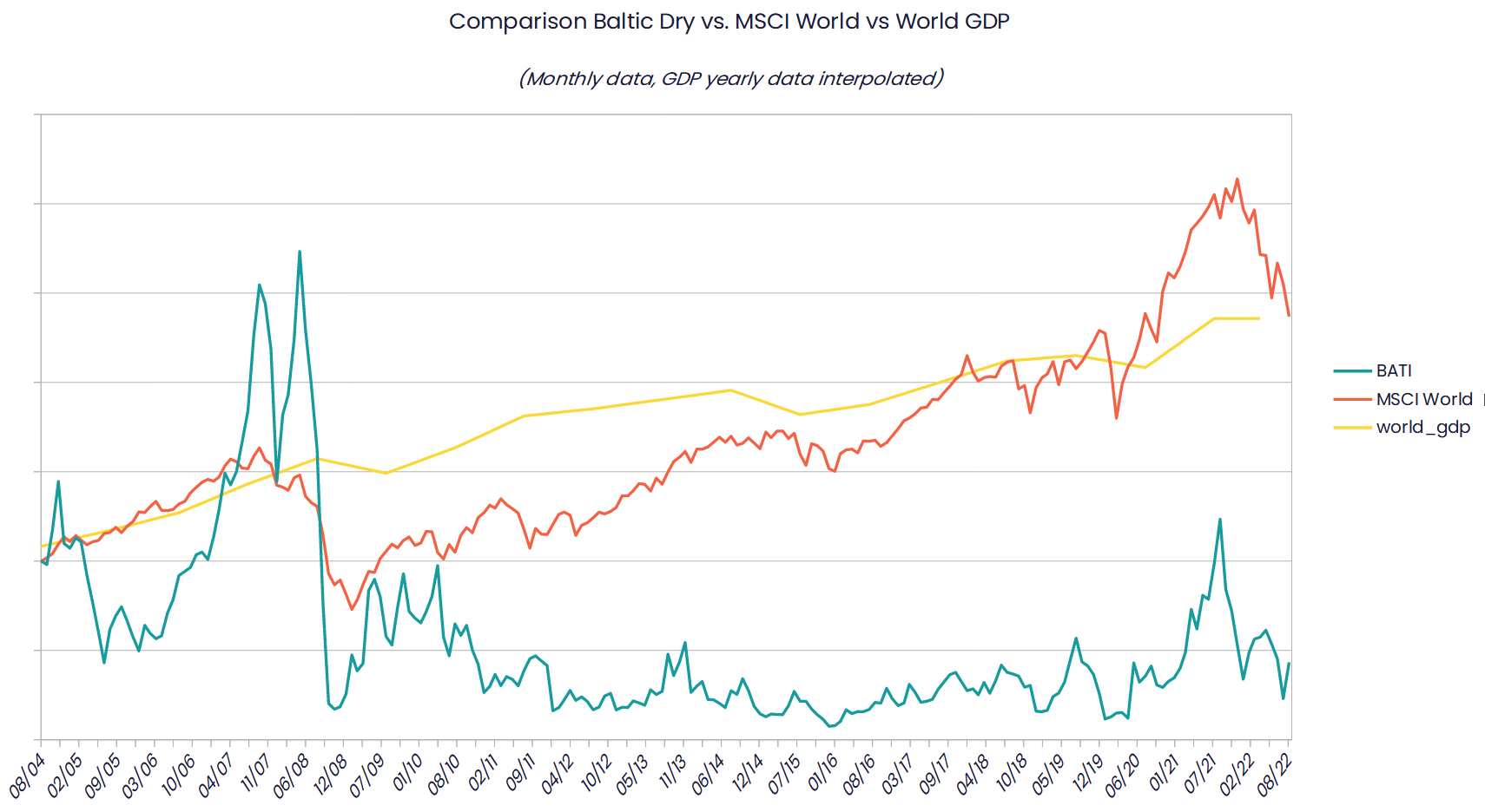
Let’s have a look at a chart with the last 18 years:

I plotted the Baltic Dry against the MSCI World Index, which reflects the world’s biggest corporations, compiled in one index. Because of a strong bias of US stocks within this index, I additionally added data from the World Bank: the global Gross Domestic Product (GDP) (note that this data is given every year, I interpolated the data in between years to get a monthly comparison to both BATI and MSCI World).
As you can see, during 2008, 2014, and 2019, the Baltic Dry index did indicate global economic slowdowns, even months before they became visible in the World Bank´s data. Again keep in mind (as said above) that the GDP is compiled yearly. But BATI still gives a good indication of the markets’ expectations.
Another aspect worth noting: the BATI is less prone to manipulation and interpretation (unlike most compiled economic key figures): it is purely driven by supply and demand, with no room for a statistical sleight of hand.
Final words
As we have seen, despite the limits of the underlying efficient market hypothesis, there is utility in knowing the economic connections of markets and supply chains. Neither the DJ Transportation Average nor the Baltic Dry Index should be used in isolation for trading/investment decisions! But they add essential puzzle pieces to a holistic picture and allow fact-based predictions for future developments.
Especially for handling recessions both indicators are helpful: Baltic Dry indicates a looming recession, while coming out of one, the Transport sector recovers faster than the broad market.
If you have additional questions or feedback, please leave a comment or drop a mail to feedback@6xfreedom.com

